
ILTC Redesign
Redesigning Verizon's International Lead Time Calculator to make a complex, data-heavy tool easier to use, more consistent, and responsive.
Making a Complex Workflow Easier
iLTC, the International Lead Time Calculator, is a Verizon portal used to estimate lead times and expected delivery dates for orders. The calculation changes based on country, product, order type, business rules, and local requirements.

Challenge
The idea behind the application was clear and practical, but the interface lacked consistency and the workflow was harder to follow than it needed to be.
My job was to redesign the existing iLTC interface, improve how the information was organized, simplify the workflow, and bring the experience closer to Verizon's brand without getting in the way of the tool itself.
Goals
Create a consistent interface across the application, reduce ambiguity, simplify the workflow, and establish reusable design patterns that could support the Verizon brand throughout the tool.
Research Methods
Meetings and interviews
After the initial client meeting, I collected the available data, videos, screenshots, and documentation. I reviewed the material with the team through meetings, email, and phone calls. I also tested the portal myself and documented the areas that felt confusing, inconsistent, or unnecessarily difficult to use.
The Product Manager walked me through the existing process in detail, including its caveats and business rules. With that context in hand, I moved into wireframes.
Target Audience
The audience fell into three main groups: current users, new users, and administrators.
The interface needed to be clear for both new and experienced users, while still supporting the additional screens and controls required by administrators.
Wireframes & Prototype
Wireframes
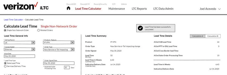
I started with about eight wireframes and reviewed them with stakeholders, the Product Manager, Project Manager, and developers. Based on their feedback, I revised existing screens and created additional ones as needed. The direction was solid early on, so most of the work became refinement rather than starting over.
Prototype
Along with the wireframes, I built a functional Bootstrap 4 prototype to show how several UI components were expected to behave. The client reviewed the prototype, and I adjusted it based on their feedback.
Visual Research
Verizon Brand
I reviewed Verizon's Brand Guidelines from Marketing along with the Design Layout Guidelines created by a development team in India. The goal was to understand what we needed to follow, what could be adapted, and how those rules could support the workflow shown in the mockups.
Unfortunately, the Design Layout Guidelines were limited in several ways. The layout was fixed, and everything was too white. Space was another problem. This application needed to show a lot of data without forcing users to scroll constantly, so we had to use the screen more efficiently and get outside the limits of the provided layout.
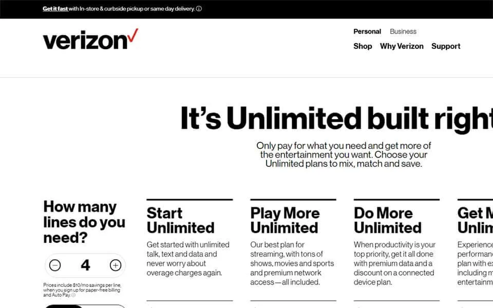
I noticed that the Verizon Wireless website still followed the brand while using UI patterns that were not included in the Design Layout Guidelines. That gave me a stronger reference, so I adjusted the design to align more closely with the Verizon Wireless experience.
The Design Layout Guidelines were also based on Bootstrap 3, while the client wanted Bootstrap 4. I had to adapt the patterns so the design worked with the newer framework.
I also created a new iLTC logo inspired by the Verizon FiOS identity so the application felt more connected to the larger brand.
What Changed
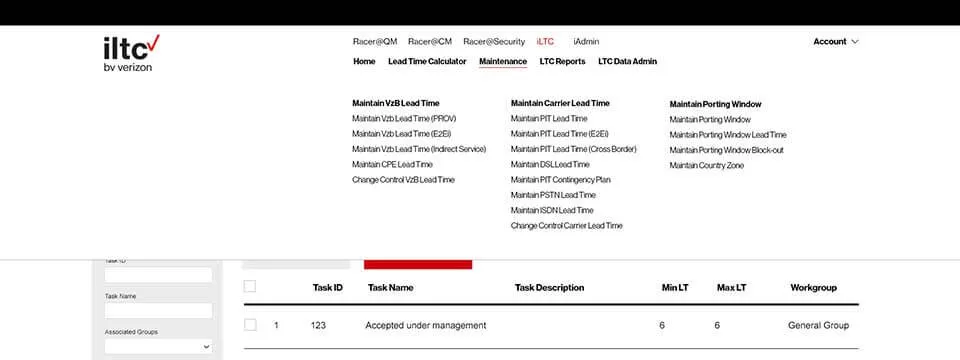
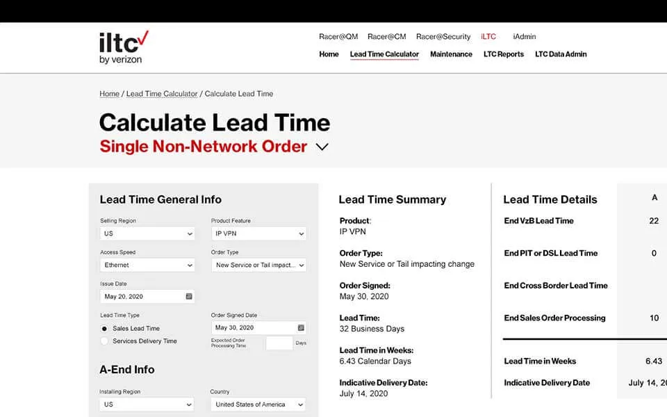
I initially created 13 mockups, then added more as the client needed them. The set covered the homepage, dropdown navigation, lead-time calculator screens, maintenance areas, and several admin screens.
Verizon brand consistency
Keep the interface consistent with Verizon's brand without sacrificing the needs of the application.
Full responsive design
Adapt the interface to different screen sizes, platforms, and orientations.
Device and browser independence
Support a wide range of devices and browsers without changing the core experience.
Easier to maintain and update
Use readable, semantic code that would be easier to update and maintain.
Easy navigation system
Keep navigation consistent across pages so users can find what they need without relearning the interface.
Concise and clear categories
Group related items into clear categories so the interface is easier to scan and understand.
Reduce clicks
Group related actions so users can reach what they need with fewer clicks.
Boost user experience
Use a consistent layout so users can move through the workflow without stopping to relearn the interface.
Faster interaction
Keep related controls and information close together to reduce unnecessary back-and-forth movement across the screen.
Improve Scannability
Remove unnecessary elements so the interface and its data are easier to scan.
Collect and display data effectively
Break forms into logical sections, with fields that change dynamically based on user input.
Display results in a structured layout that is easier to scan.
Conclusion
Once the mockups were reviewed and approved by the Product Manager, I started coding. I built the main template in HTML and CSS and completed as many additional pages as the schedule allowed. Visually, the design leaned more toward the Verizon Wireless portal, while the implementation combined Bootstrap 4 with parts of the Design Layout Guidelines provided by the development team in India.
One of the things I enjoyed most was the collaboration between teams and the trust I had from the Product Manager. Some of our decisions went against the provided Design Layout Guidelines, but we were able to explain why those changes made sense for this application. And it paid off.
This was never going to be a flashy consumer site. iLTC is mostly forms, rules, and data. The goal was to make that complexity easier to work with, and we did. I was extremely happy with the result and proud of the work.