Case Study: iLTC redesign
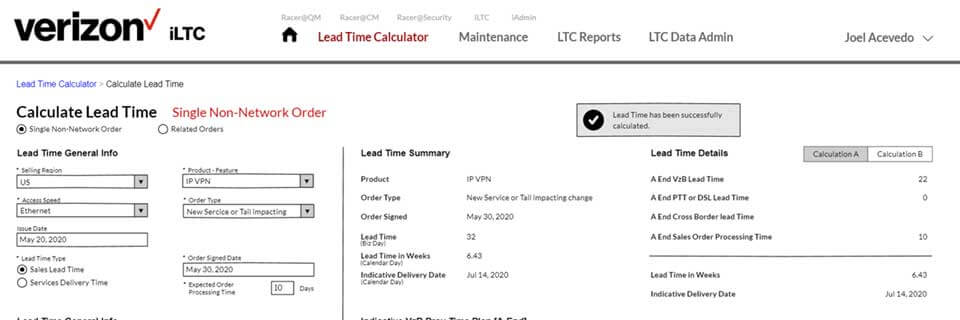
iLTC, International Lead Time Calculator, is a Verizon portal that helps users to estimate the duration and expected delivery dates of orders based on users lead time needs. Depending on the country, product and order type, business rules and regulations can be applied to calculate the lead time.
Tools
Balsamiq Wireframes, Adobe Photoshop, HTML, CSS, jQuery, Bootstrap v4, Verizon Brand Guidelines
Challenge
The idea behind the application was clear and practical. However, it lacked coherence and consistency.
The challenge was to redesign the existing iLTC interface to improve the information architecture and maximize the workflow, while providing a consistent user experience In line with the brand identity, values, and strategy of Verizon.
Goals
Create a consistent interface for all areas of the tools. Reduce ambiguity and simplify workflow. Create a set of design patterns and architecture for consistent branding.
Research Methods
Meetings and interviews
Following the initial meeting with client, I collected all data, videos, screens and documentation available. I analyzed all these material and reviewed them with the team via email or phone during our meetings. I also tested the portal and created a list of areas of concern I experienced while using the application.
The Product Manager also had a series of meetings to explain the existing process in detail and its caviats. With all this content in hand, I proceeded to create the wireframes.
Target Audience/Persona
Our targeted audience was divided into 3 types: current users, new users, and administrators.
The design needed to be clean, simple and easy to understand for both new and current users. Additional screens were needed for those with administrative rights.
Wireframes
In the beginning I created around 8 wireframes. We reviewed these wireframes with stakeholders, product manager, project manager and even developers. Additional feedback was given. Eventually I created additional wireframes or modified the ones already made, based on feedback and requests from the client. But overall, I was on the right path.
Prototype
In addition to the wireframes, I created a fully functional prototype to demonstrate the expected behavior of several UI components. This prototype was created using Bootstrap v4. This prototype was also evaluated by client. I made changes as per feedback.
Visual Research
Verizon Brand
I researched the Verizon Brand Guidelines (created by the Marketing team), along with the Design Layout Guidelines (created by a Development team in India), and evaluated how these could be implemented the right way on our application in order to maximize the workflow and the information architecture as proposed on the mockups.
Unfortunately, the Design Layout Guidelines were limited in so many ways. The layout was fixed and everything was too white. Another problem we faced was space. While real estate is good to have, in our application we needed to use as much screen as possible in order to fit the data we needed to display without scrolling too much. So we needed to get out of the box.
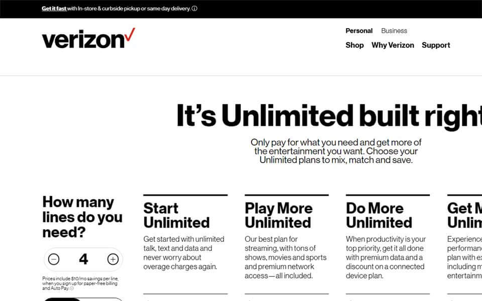
I noticed the Verizon Wireless website follows the brand, and has a few UI components that were not part of the Design Layout Guideleines. So I took the liberty to make some modifications to my design and align it more to the Verizon Wireless website.
Additionally, the Design Layout Guideline was using Bootstrap v3. The client wanted to use Bootstrap v4. So I had to make adjustments to make everything work as planned.
I also created a new logo for iLTC, inspired by the Verizon FiOS logo, to keep in touch with the brand.
Highlights of Redesign
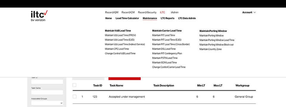
A total of 13 mockups were initially created. Additional mockups were created as needed as per client. These screens included the homepage, dropdown menu, lead calculator screens, maintenance, and a couple of admin screens.
Verizon brand consistency
Providing a consistent user experience In line with the brand identity, values, and strategy of Verizon.
Full responsive design
Respond to the user’s behavior and environment based on screen size, platform and orientation.
Device and browser independence
Works on a wide variety of devices regardless of the hardware or browser used.
Easier to maintain and update
Easily readable, friendly and semantic code that is simple to update and maintain.
Easy navigation system
Easier navigation ensures the interface retains cohesion across all pages and makes it easy for users to find what they need.
Concise and clear categories
Improve the usability by classifying and organizing items based on similar categories.
Reduce clicks
Grouping items into categories make it easy for users to find what they’re looking for with fewer clicks.

Boost user experience
Consistent layout and appearance helps with the user’s workflow.
Faster interaction
Reduce the amount of back-and-forth hand and eye motions. Keep all complementary data within close distances.
Raise visualization
By removing unnecessary elements, we maximize the scannability of the interface and data.
Collect and display data effectively
Forms have been separated into logical sections, with fields that dynamically change based on input.
Results are displayed in an organized layout easier to scan.
Conclusion
Once the mockups were examined and approved by Product manager, I went ahead and started coding. I created a template page in HTML and CSS, and as many additional pages as possible as time permitted me. While my design resembles more the UI of the Verizon Wireless portal, I ended up using a hybrid version of Bootstrap v4 and the Design Layout Guidelines styles provided by the Development team from India.
One of the things I enjoyed the most was the collaboration between teams, and the trust and support from the Product manager. Some of the decisions we made were really against Design Layout Guidelines, but we were able to convince the team that it was the right move to make. And it paid off.
Of course, the Verizon Wireless portal has more photos and media. This application is all about forms and data, and it may not look as appealing. However, the goals were successfully met and I am extremely happy and proud for it.
Contact
You can simply email me at