
Freedom Health
Redesigning a Medicare Advantage website to make it easier to use, fully responsive, and easier for our team to maintain.
A Homepage That Needed to Work Harder
Freedom Health is a Florida Medicare Advantage HMO. The website is designed to help new prospective members find plans and existing members find their area offices and support. This case study focuses on the homepage — helping these users find information easier and more efficiently.
Challenge
The existing site had some issues. The parallax design was adding unnecessary noise, making the page way too long. Images were slowing down performance. Cards had animations that weren't providing any useful information. The coverage map didn't work well on smaller screens. And the footer was long and messy.
The biggest challenge wasn't necessarily changing the look, but stripping down the noise that was disrupting the experience while users were just trying to get the information they needed. We needed a website that synced with brand standards, was fully responsive, and made information easier to find. On the technical side, that meant migrating Bootstrap 4 to a newer version, removing jQuery UI, and creating modular templates we could maintain through the administration dashboard.
Goals
Stay on brand with our style standards. Reduce components that were repeated or distracting from the main purpose. Create reusable components we could use across other sections and pages of the site.
While this case focuses in homepage redesign, similar work was done with dozens of subpages.
Looking at What Others Were Doing
Before starting any mockups or wireframes, I personally reviewed over 20 websites, most of them Medicare or insurance sites — including Aetna, Humana, and Cigna. I also checked internal sister sites like Blue Cross Blue Shield and Anthem. I compared visual design, navigation, headers, footer, imagery, search, components, and layout composition, noting what was working and what we could learn from.
What I Found
- • Hero Carousels Were Nonexistent: the majority of sites used a simple hero with a clear purpose. None ran a slideshow or carousel, and none had search built into the hero the way ours did.
- • Color Blocking Over Borders: the designs I liked most relied on color blocking to separate content, rather than lines or borders. None used parallax scrolling.
- • Footers Were Heavy: most footers were bulky and inefficient — this shaped our own approach, since we wanted a footer that worked without repeating content, so we aimed for something more compact.
- • Accessibility Was a Gap: only three sites offered a text size control for content.
Turning Research Into Designs
Instead of one design or one markup, I created multiple components for each section and gave the team options — several directions for the hero, several CTA sections, a couple of footer variations. For every component needed, I built two to three possibilities so the team could choose rather than have the decision made for them.
The options were reviewed with our team, and with their input I developed a more complete design, which we demoed to business partners and stakeholders. We took the feedback, made adjustments based on requirements, and through collaboration — especially with the marketing team, QA, and business side — narrowed it down to the final version.
What I Changed and Why
Hero — Keep the Variety, Lose the Slider
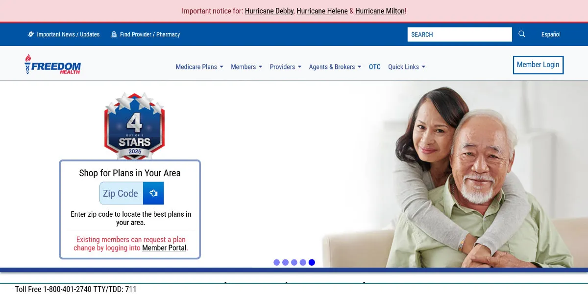
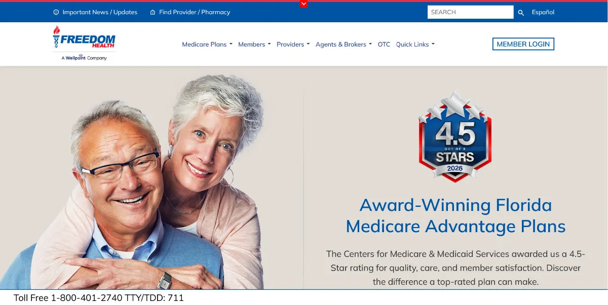
The original hero was a slider that only changed images, combining two competing elements: the plan search form and the CMS rating. Having both there was a mistake, so I created multiple markups — one with the form, one with just the star rating, one with something else. The team chose the star rating. To preserve the "fresh" feeling the slider originally gave the site, I proposed rotating in a random image on each visit instead — a pool of 9-10 images, so the homepage looks different every time.
Notice Bar — Made Collapsible
The alert bar at the top was sticky, roughly 100 pixels tall, with no way to collapse it — pushing the rest of the page's content down. I made it collapsible and added a cookie to remember the user's choice, so the bar stays hidden once dismissed.
Plan Benefits — Out of the Cards
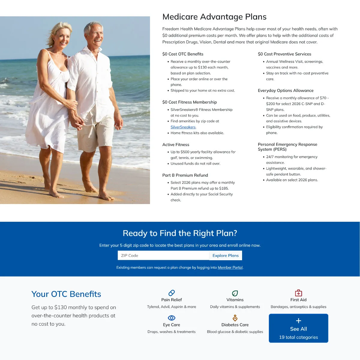
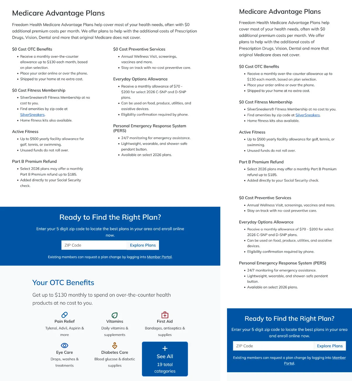
This was one of the components that benefited most from the redesign. The original cards were spread too far apart and hard to read. I pulled the content out of the cards and rebuilt it as a two-column layout, making it easier to scan and easier for users to find the benefits that mattered to them.
Service Area — Simplified
Replaced the broken interactive map with a simple list of counties and what's available in each. I'd also designed a more detailed service area version, but the team decided it was more than necessary, so we scrapped it in favor of the simpler approach.
Building Things We Could Reuse
Have Questions
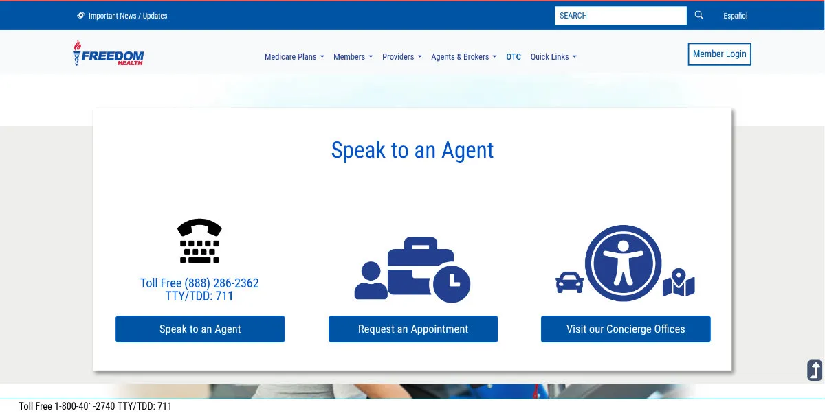
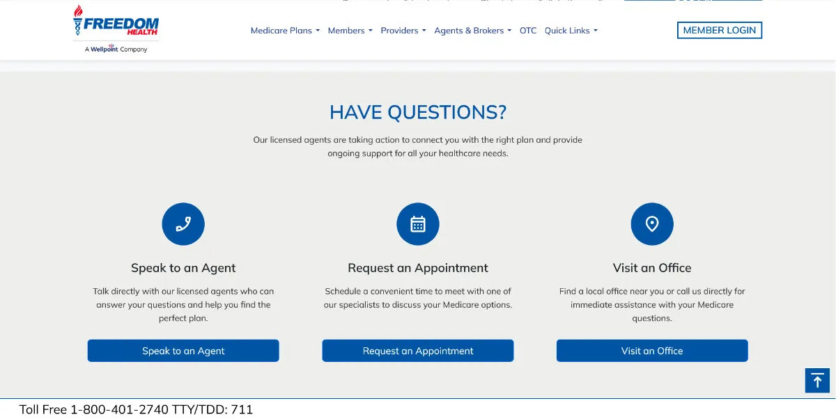
The original CTA buttons here were oversized and unclear. I grouped them into a new "Have Questions?" component, reused across multiple pages, which both cleaned up the section visually and improved the experience. The accompanying form was reformatted, and I added status messages during submission — previously there was no indication anything was happening, which led some users to get frustrated and resubmit unnecessarily.
Find Pharmacy / Find a Doctor
These were two separate containers taking up space and causing unnecessary scrolling. I merged them into one section; both paths route to the provider side of the site.
Mega Menu
Already redesigned prior to this project, but built for Bootstrap 4 — moving to the new framework version required rework.
Fixing the Smaller Pieces Too
The redesign wasn't only about the big sections. Search moved out of the hero into its own standalone CTA strip. OTC got a direct link on the homepage, since analytics showed it was one of the most visited pages on the site with no path to it before. I added a numbers section highlighting network stats — pharmacy counts and locations across Florida — and simplified the footer so it wasn't long or cluttered anymore.
Brand Consistency
Collaborated with marketing for brand consistency, applied updated typography guidelines, and switched to Material Icons in place of Font Awesome.
Full Responsive Design
Every section was rebuilt to be fully responsive, with breakpoints and transitions tested across devices.
Clearer Form Feedback
The "Have Questions?" form was reformatted and updated with status messages during submission, so users always knew something was happening instead of wondering if it worked.
Reusable Components
The "Have Questions?" widget and the collapsible notice bar pattern were both built once and reused across multiple pages, cutting down on future maintenance.
Decisions Based on Research
Most of the major changes traced back to either the competitive research or a real usability problem with the existing site — not just aesthetic preference.
Notification Controls That Remember
The alert bar is now collapsible, with the user's choice remembered via a cookie so it stays hidden once dismissed.
Built and Delivered In-House
The whole site was built in-house — no agency involved. I personally handled the design, mockups, markup templates, and CSS, though other departments were involved as well, since this website is huge — almost 100 pages — split across different teams.
The migration from Bootstrap 4 to Bootstrap 5 was also challenging, especially because of the mega menu conversion.
What Changed
We needed to modernize and improve things, and we tackled that by researching other companies in the industry — not to copy, but to see what we could learn from them. We ended up with our own solutions in-house, and a modern, up-to-date website projected to increase traffic. Doing it in-house also saved us around $50,000.
* Note: Optimum also benefited from similar changes, but this case study is focused only on Freedom Health.