
Optimum HealthCare
Creating a flexible system for Optimum HealthCare that allows us to display layouts and components efficiently based on the content of each subpage.
One Site, Many Different Pages
Optimum HealthCare is the sister brand to Freedom Health. Both sites share the same platform and structure, while keeping their own unique brand, colors, and imagery. This case study focuses on the dozens of subpages we also redesigned — benefits, enrollment, pharmacy information, service area, newsletter, navigation, and other content members, providers and agents use on a daily basis.

Challenge
The content of subpages varies in length, width, density. We needed a system flexible enough to handle different amounts and types of content, without forcing every single one of them into the same layout.
For example, a newsletter may need a wider range compared to a pharmacy directory. An enrollment page definitely needs to display its content in a completely different way than a sitemap. The challenge was how to do all these, while maintaining all content as one cohesive site.
Goals
Build a flexible set of layouts that could adapt to different types of content without sacrificing readability, purpose and efficiency. The key was to display the content and components in a simple and usable manner while improving semantics, accessibility and experience.
In another case study, we only focused on the redesign of Freedom's homepage, even though Optimum had similar upgrades.
Four Layouts for Different Content
Instead of forcing every page into one layout, I built four different widths — standard, wide, full, and w100 for the handful of pages that actually need the whole screen. Which one gets used depends on the content itself, not on which one happens to look nicer.
Standard (Narrow)
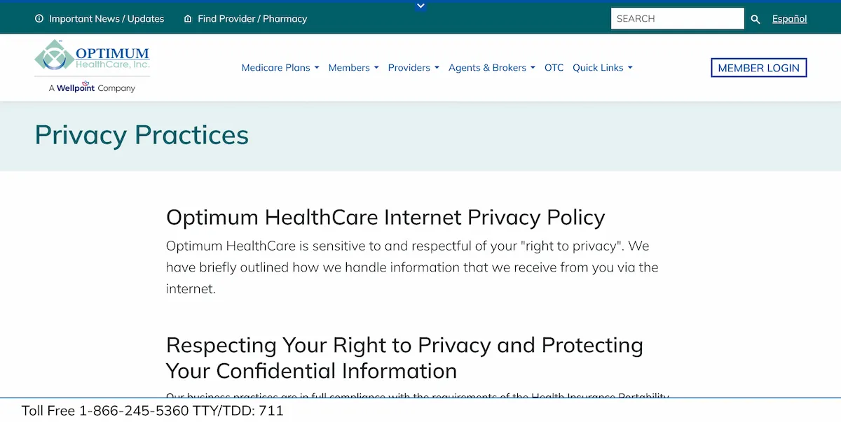
Used for longer, text-heavy pages like Case Management and Privacy Practices. Keeping the content narrower makes dense medical information actually readable instead of one long wall of text.
Wide (Structured)
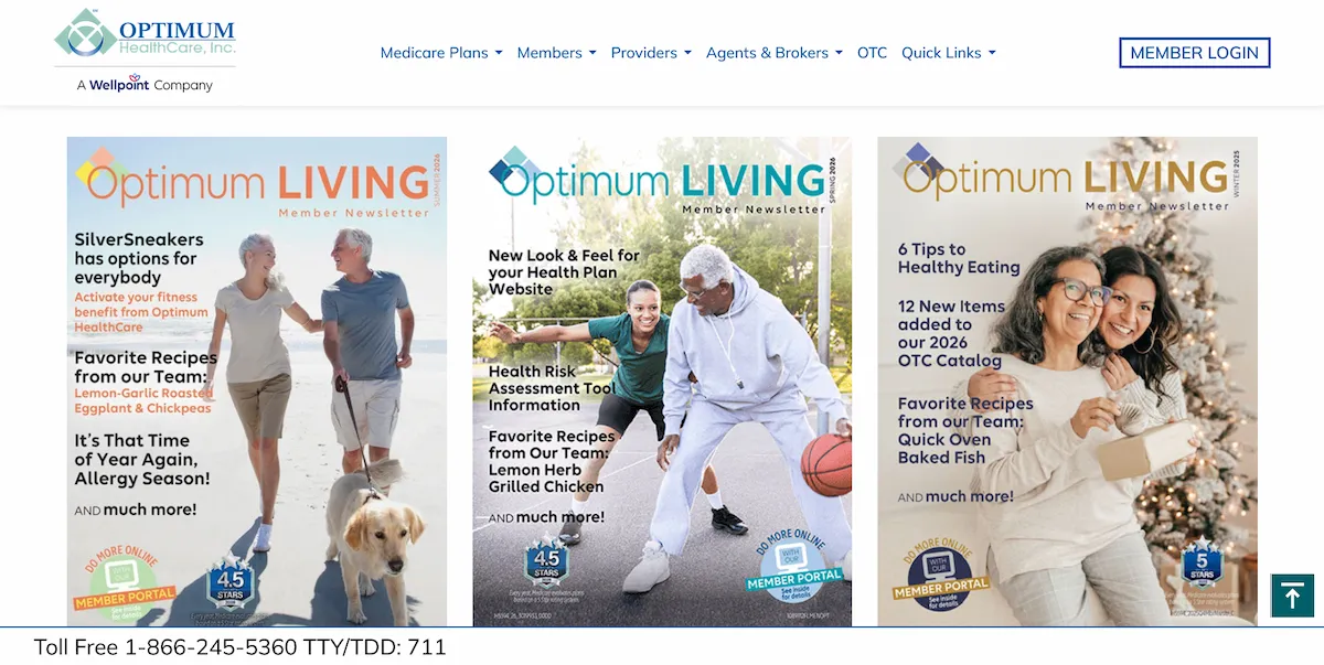
Used for structured pages like the Enrollment Center and Medical Advantage Plans — two-column content and multiple actions need room to breathe, but not the entire screen.
Full & w100 (Dense)
Used for the denser pages with multiple content sections. Three-column layouts work well for organizing related information side by side, and for when supporting content benefit from the extra space.
More Than a Visual Redesign
Search — Rebuilt From Scratch
The old search needed more than a visual pass, so I rebuilt the whole experience. It now requires at least three characters, gives clear error messages, repeats back the user's search term, highlights the matching words in results, and adds pagination once you pass ten results.
Clearer Page Titles
Every page title now sits in its own colored banner, clearly separated from the body content. I also left room underneath for breadcrumbs, so they can be added later without having to redesign the header all over again.
Service Area — Simplifying the Map
The old interactive map had tooltips that could clip or land off screen, and it was a pain to maintain. I replaced it with a simpler county list and stable tooltips showing office counts — easier to maintain, easier to search, and readable by assistive technology.
Sitemap — Use the Available Space
The old sitemap only used the left third of the page and left most of the screen empty. I rebuilt it with CSS multi-columns, so the same list automatically flows from three columns down to two, then one, as the screen shrinks — no duplicated markup needed.
Build It Once, Use It Everywhere
One Navigation Pattern, Sitewide
Medicare Plans, Members, Providers, Agents & Brokers, and Quick Links all use the same grouped-column menu pattern now, with clear section headings. OTC stays a direct link — adding another menu layer would've just made it harder to reach.
Icons Only Where They Actually Help
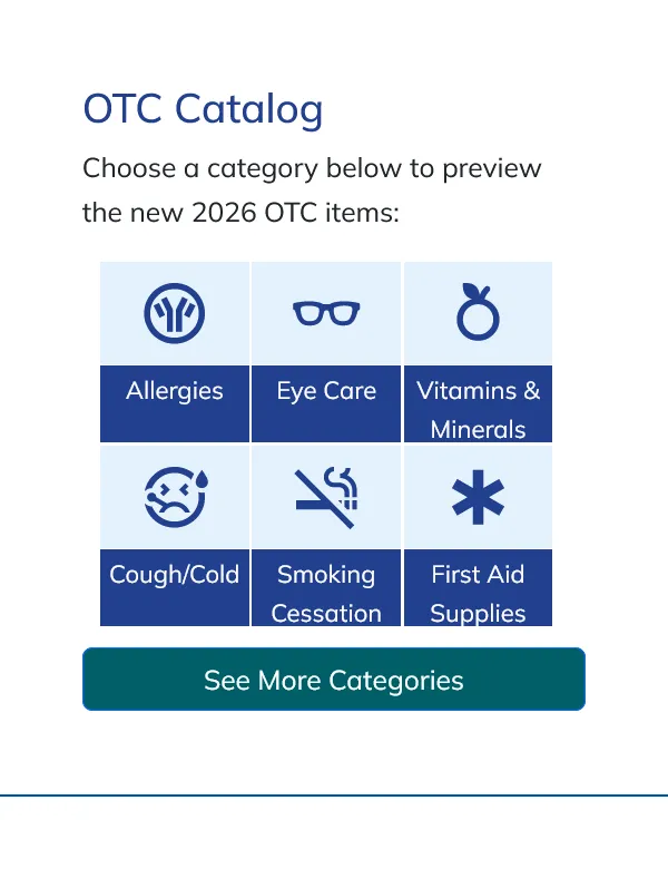
I moved the site to Material Icons and pulled the decorative ones out of places like the navigation and footer where they weren't doing anything. Icons stay where they genuinely help people scan — OTC categories like Allergies, Eye Care, Vitamins, and Cough & Cold, for example.
Making Pharmacy Content Easier to Reach
A 21-item table used to sit at the very top of the Pharmacy & Part D page. I swapped it for a smaller left-side nav so people can actually get to the pharmacy content instead of scrolling past a giant table first.
A Simpler System to Maintain
Layouts Based on the Content
Four container widths give each page room for its content while keeping long medical information readable instead of cramped.
Accessibility Built In
Used SortSite to check contrast, markup, keyboard navigation, and screen-reader accessibility across the site — not just the flagship pages.
Reusable Components
Mega-menus, accordions, and sitemap patterns got built once and reused sitewide, so future updates don't mean rebuilding the same thing five different times.
Don't Overcomplicate It
The service area didn't need a fancier map. A simple county list did the job better and was actually maintainable.
A Cleaner Footer
Long legal disclosures moved into expandable sections, and the last-updated info got its own strip, so the footer was actually easy to scan again.
Same System, Different Brand
Freedom and Optimum run the same underlying layouts and components — Optimum just keeps its own teal and gold branding and imagery on top.
What Changed
The homepage redesign took care of the first impression. The subpage work made sure the rest of the site actually followed through on it. Members can read dense benefits information without a headache, providers can move through archives and resources without fighting the layout, and content that used to depend on mouse interactions works for everyone now.
Most of these changes aren't flashy on their own — that's kind of the point. Together they add up to a site that's more consistent, easier to use, more accessible, and a lot easier for our team to maintain across dozens of pages.